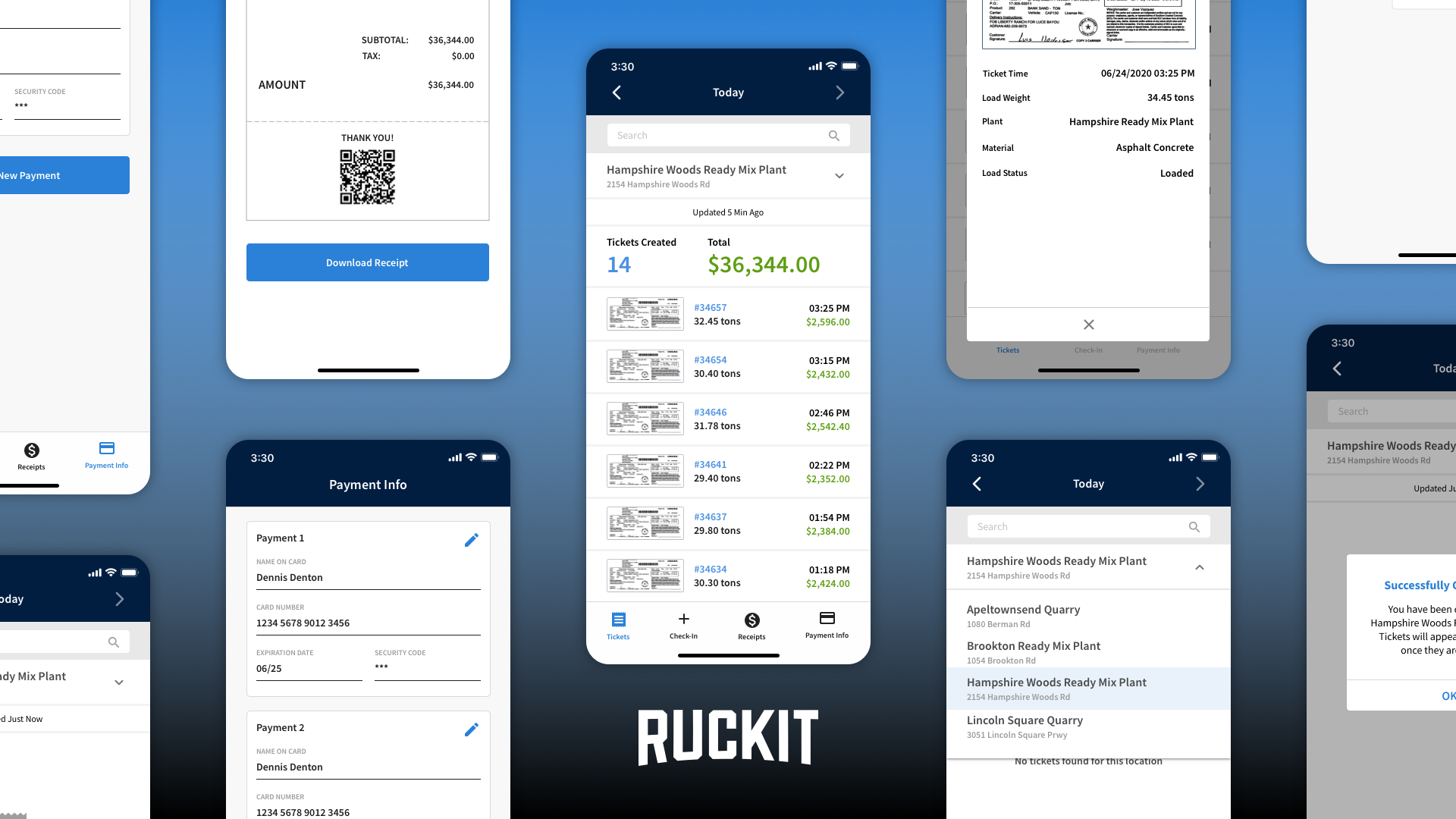
Ruckit develops software for the construction industry particularly for material producers and trucking companies. Ruckit's flagship mobile application is developed for truck drivers who use it to receive and track a days work. In order to attract new customers and keep current customers satisfied new features needed to be added and certain components revamped. Truck drivers are not the most tech savvy and require great amounts of convincing to try new tools. With this in mind we set out to create an experience that truck drivers find desirable to use and made their work day easier while maintaining necessary requirements requested by trucking companies.
App Icon
Updates to the Ruckit driver app coincided with updates being made to Ruckit's brand identity after being acquired by Command Alkon. The logo displayed on the app icon is updated to match other apps in the Command Alkon suite of applications.
Orange is used as the background color and the Command Alkon logo mark is displayed at the center bottom on all app icons in the Command Alkon application suite.
Navigation
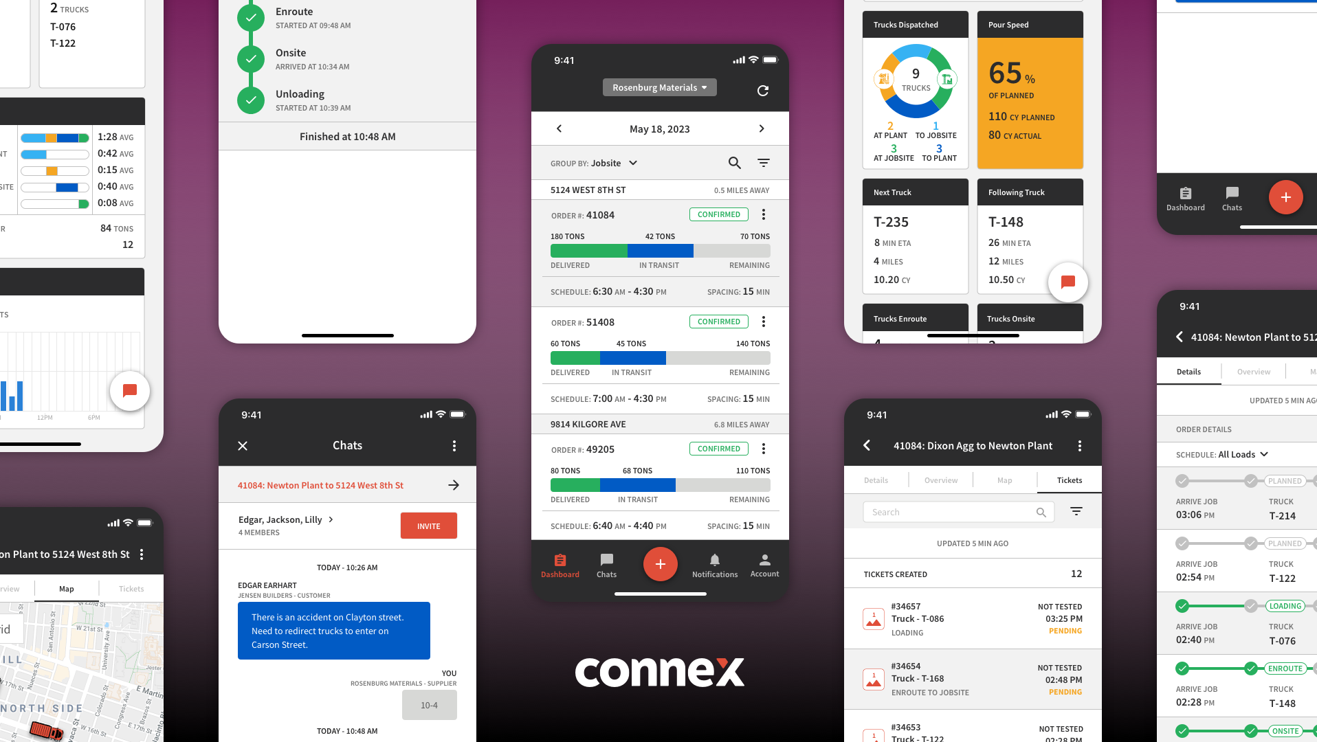
For V3 of the Ruckit Driver app we updated the navigation from a hamburger menu to a bottom nav for easier access and visibility.
V2's hamburger nav menu allowed to a long list of nav options but wasn't very discoverable for drivers. Placing the nav menu at the bottom where the most used nav options were always visible improved onboarding of new drivers on the app. The new nav also lead us discover which screens were used more heavily than others.
FAB (Floating action button)
In V2 certain actions and components were accessible using a more icon that opened a modal when tapped. This made the discovery of these features cumbersome for drivers. V3 a FAB is always displayed in the nav menu and opens a full screen modal containing a list of available actions.
V2 components such as the lunch break and vehicle breakdown were only available on screens that displayed the more menu icon. V3 lunch break and vehicle breakdown and other components are available on all main nav sections.
Assignments
Assignments are created when drivers have been dispatched to a job. An assignment contains the locations, material, start time, etc for the job. Drivers can have multiple assignments each day so being able to view details of the job is vital to distinguish between jobs.
The assignments screen act as the home screen and displays all jobs the driver has been dispatched too for the day. V2 displayed very little job info and in order to accept or reject assignments drivers were navigated to another screen. V3 displays much more job info and allows for the accepting or rejecting of an assignment without having to navigate to another screen.
Order / Job Overview
All job information is displayed on the overview / details screen. Accepting or rejecting an assignment can also be done from the overview / detail screen.
V2's job overview layout didn't have enough contrast or information hierarchy. V3 added more information hierarchy and displays buttons for directions to the job's locations.
Trips
Trips are created when drivers perform work on jobs. Within trips drivers track progress and input information such as ticket images and tonnage.
V2's trip screens didn't include much info about the current job the driver was working. V3's trip screen included a summary of job details so that the driver has more context when inputing information.
Punch Cards
Punch Cards allow for drivers to record hours of work done on a job for a given day. Not every trucking company requires drivers to record hours of work as some companies don't pay drivers by the hour so the use of punch cards are varied across the industry.
V2's punch cards were only accessible from the trip screens meaning drivers had to be in a trip in order to start and end punch cards. V3's punch cards are accessible on all main app nav sections using the FAB button.
V2's punch cards opened modals at both the starting and ending of a punchcard, elapsed time since the starting of a punch card was not displayed to the driver. V3 displays a counter at the top of the screen and only one modal is used at the ending step where the driver confirms the start and end times and inputs information.
Tickets
Tickets are created when trips are completed by drivers. Tickets function as proof of delivery and are vital in the billing process.
V2 tickets screen didn't display much ticket info and lacked the ability to search for a specific ticket. V3 tickets displays much more ticket info and adds search functionality. Tapping on a ticket navigates to a screen displaying the image of the ticket.
RUCKIT DRIVER APP PRINTable How To GUIDES
Truck drivers not being very tech savvy required us to create printable how to guides of the driver app. These how to guides allowed drivers to keep in trucks for easy access whenever they came across common help desk issues.
Guide for login and driver confirmation
Guide for login and driver confirmation continued
Guide for starting shift and trip creation
Guide for Tickets screen and More nav section
Guide for Lunch Break
My Involvement & Contribution
The team allocated to the Ruckit Driver app version 3 project consisted of one front end developer, one back end developer, one project manager, two members of the customer success team and a designer. As the designer on the project I collaborated with the project manager and customer success team to determine feature requirements and gather customer needs. I then worked with developers to get an understanding of what can be done within the timeframe set my the project manager. Once my first version mockups were completed I created an interactive prototype to convey design direction to the team. Gathered feedback from the team and made necessary revisions. With revisions made I utilized the interactive prototype to demo for customers to gather their opinions. Using Zeplin I handed off designs to development team once customers’ feedback were included in designs. I QA tested and gave implementation feedback to developers once code was pushed to the development environment. To prepare for release I collaborated with the customer success team, project manager and development to create app store assets and printable app guides to assist with user training.
Link to interactive V3 Prototype
Have a little fun and play around with an interactive prototype of the Ruckit Driver app V3 using the link below.
Links to Ruckit Driver App download page in App stores & Ruckit Website
Apple App Store
Google Play
Ruckit Website
